Why does one commercial planting scheme look “expensive” at a glance?
I took a set of street photographs of commercial planting recently.
The same white walls, the same concrete paving: some look expensive at a glance, while others are planted to the brim and still look messy, tired and cheap. The difference is rarely the budget; it is a few concrete details: silhouette, texture, proportion, pruning and maintenance.
I picked five and will go through them one by one.
01 Start with a silhouette, then talk about plants
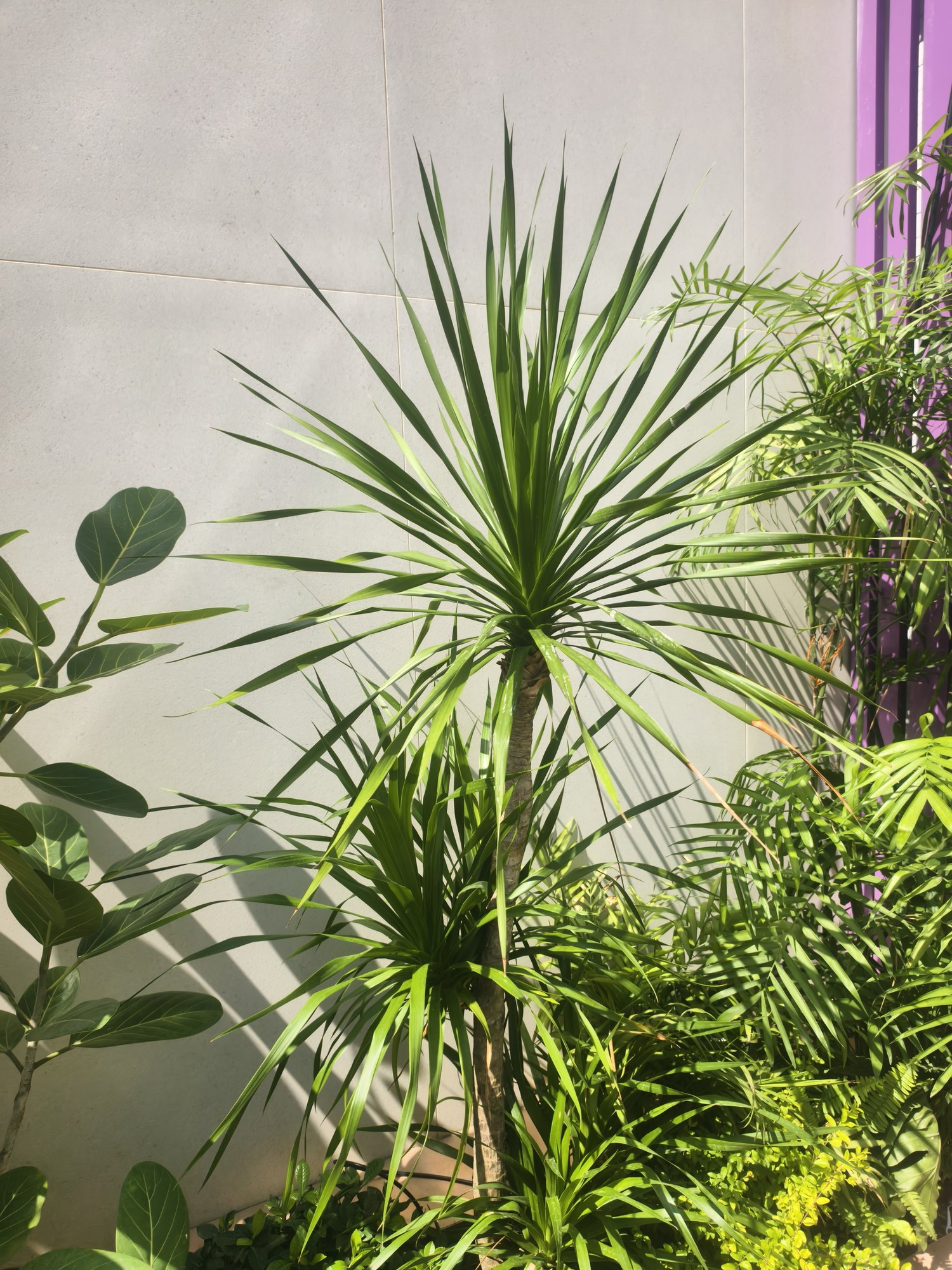
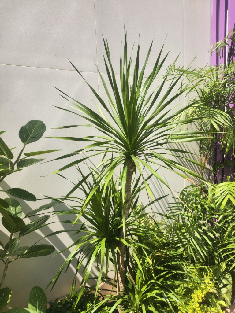
This plant has no flowers and no crowd of small pots around it, yet it is immediately memorable. The reason is simple: it has a clear silhouette, and the wall beside it is clean enough.
Commercial entrances, white walls and corner positions suffer most from “filling every gap”. The more plants there are, the more the eye scatters; leave some space, and a single plant’s form has a chance to be seen.
When choosing, look at three things first: whether the leaves all point in a consistent direction, whether the whole plant has a clear outline, and whether it will turn into a blob as it grows. The first two decide whether it looks good now; the third decides whether it still will in two years.
If you are choosing a single plant for an entrance, start with the Outdoor plants categories.
02 The texture of the leaves decides the depth of the picture
The depth in this picture does not come from piling on colour; it comes from leaf texture: fine, broken, silver-grey leaves above; feathery, brighter green below; reflective glass behind.
Fine leaves against coarse leaves, matte against gloss, upright against spreading: two or three contrasts are enough to make the picture work. The opposite — a little of ten different plants — means nothing gets to be the focus, and the result just looks busy.
Commercial planting does not need “many species”; it needs clear relationships: who is on top, who is below, who is the backdrop, who is the focal point.
03 The planter is part of the building
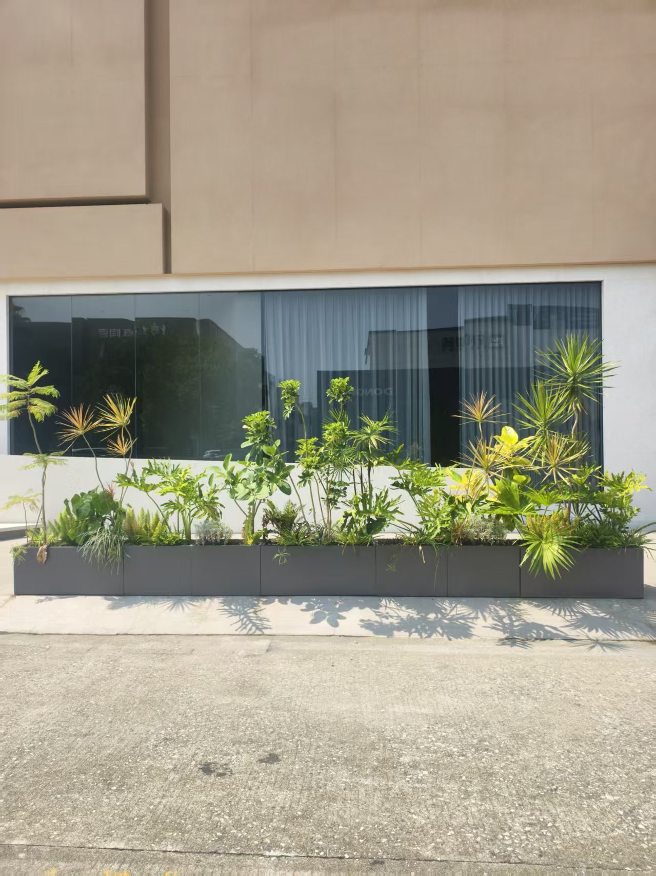
Many projects treat the planter as a “container for soil”: choose the cheapest grey box, drop the plants in, and call it done. In this picture, the length, colour and lines of the planter follow the same rhythm as the building’s window line.
A few things you can copy:
- Keep the planter colour close to the building base or paving; it should not compete with the plants.
- Do not keep a long planter at one height from end to end; give the planting a high, middle and low rhythm.
- Leave a little space at the planter edge, so the plants have room to grow and you have room to prune.
- Watch the shadows. The shadows the plants cast on the wall and ground are part of the picture in their own right.
04 Pruning is not maintenance; it is design
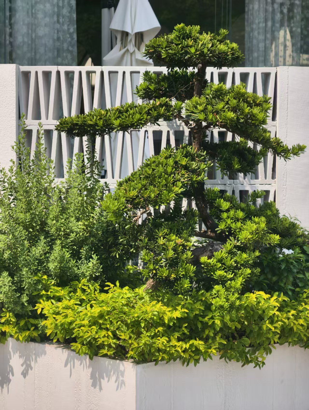
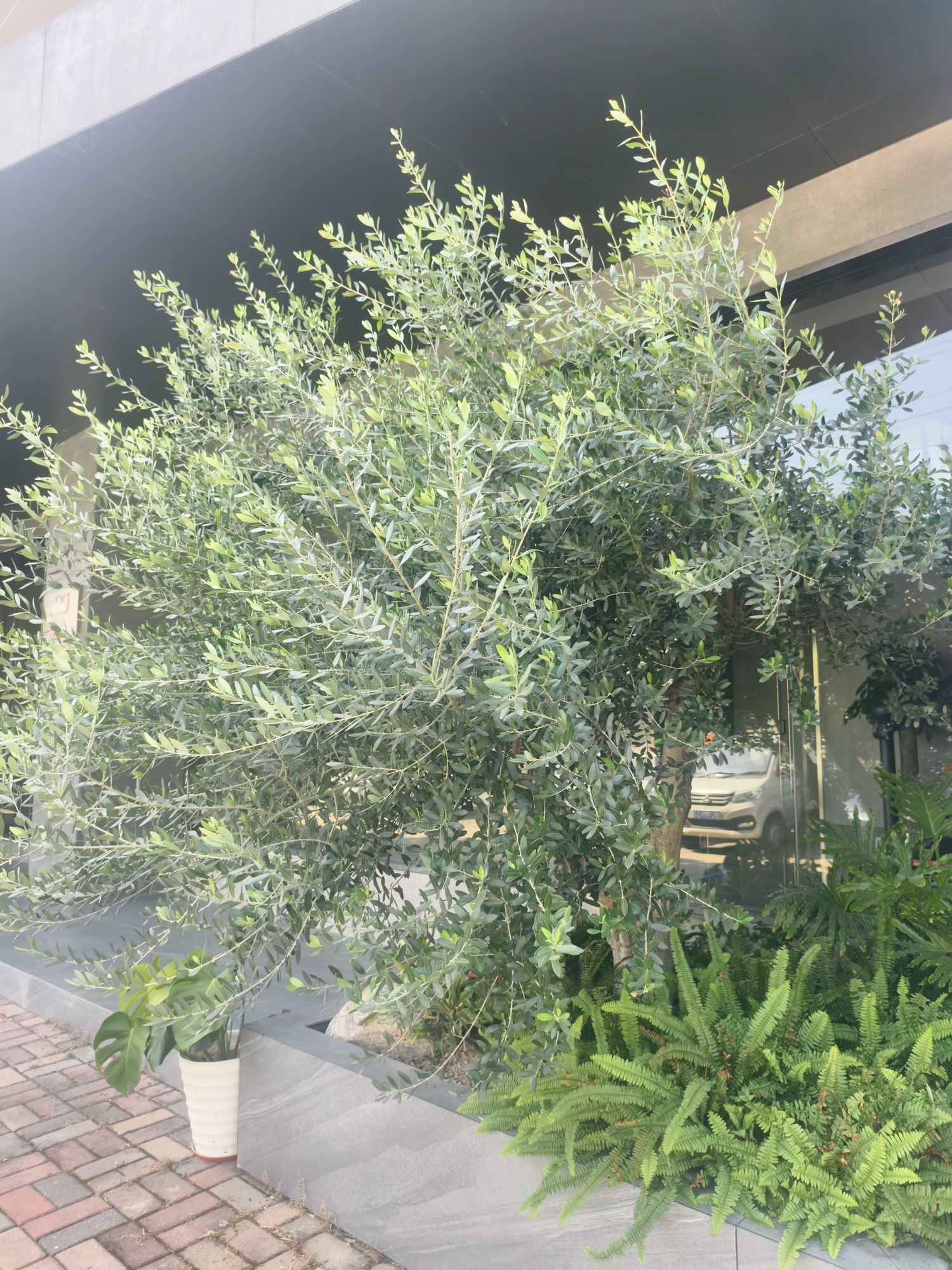
This tree looks good not because the species is rare, but because it has been “pruned”. The cloud-like layers, the exposed branches and the distance between each layer are all designed.
Pruning does three things: it sets the structure, controls the volume, and leaves breathing space. Commercial entrances need this especially — the plants cannot grow over the signage, and they cannot turn into a ball.
The prerequisite is choosing the right species: an evergreen with strong regrowth, tolerance of pruning and fine, dense leaves will take long-term shaping. Pruning is not a one-off either; it needs several rounds a year, or the clouds soon merge into one mass.
05 Maintenance sets the floor
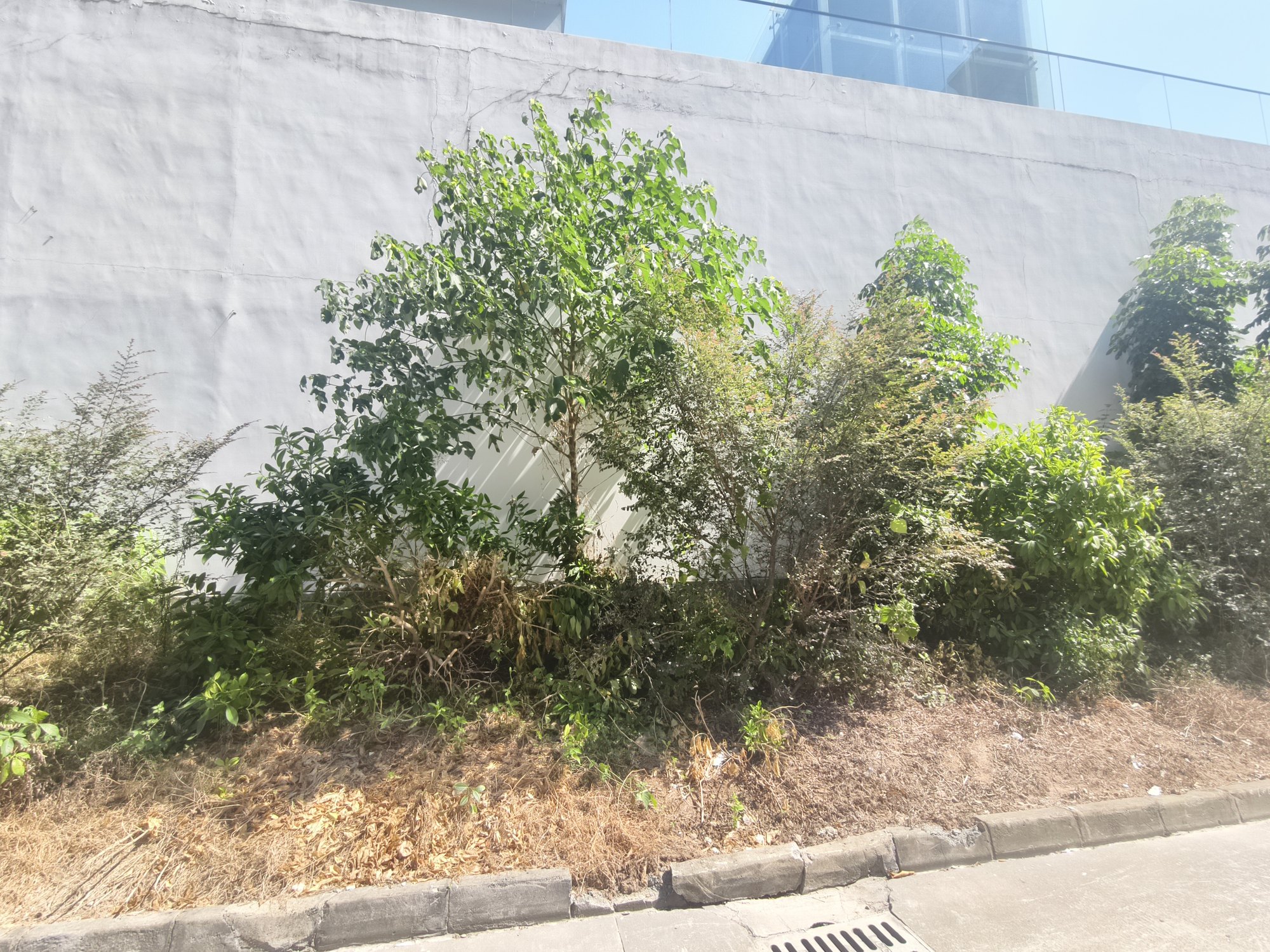
The first four pictures are about “how to make it look good”; this one is about “why it goes wrong”.
The plants in this picture are not all dead, but the ground is bare, the branches are dry and the layers have collapsed, so the whole thing looks tired. The most easily overlooked part of commercial planting is not the design but the maintenance after handover: was the soil improved, does it drain, is there enough irrigation, is the pruning kept up?
However high-end a project looks on paper, if the maintenance budget was not included from day one, it will be back to “planted, but not looked after” within a year. Entrances especially: foot traffic, leaf fall, pests and safety issues all need someone to manage them.
In closing
High-end is not about filling the space with plants, or using more expensive stone.
Give the plants a clear silhouette, use leaf texture to build depth, align the planter with the building, use pruning to keep the structure, and use maintenance to hold it all together. Do all five, and an ordinary white wall and concrete paving can still look expensive.
If you are working on planting for a shop, campus, office or clubhouse, send us a photo of the site, or see Gardening services and Landscape design; for more plants suited to Hong Kong outdoors, see Outdoor plants categories.